Posts Tagged ‘visualizations’

h1

Music infographics: two sets to explore

February 27, 2010

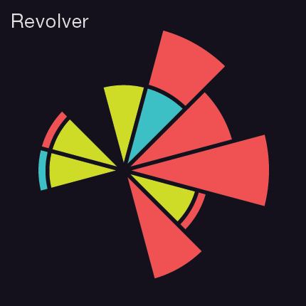
Visualizing the Beatles: Graphic designer Michael Deal is heading up a collaborative project of Beatles-related infographics, Charting the Beatles. Some stunning examples are on his site (the one above, for example, is a visualization of the keys of songs in Revolver; click here for the full graphic and key) and many more, in a wide array of styles, can be found at the Flickr group. [via Visualizing Music, which you should be reading if this stuff turns you on.]

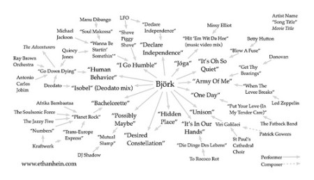
Sample Maps: Author and musician Ethan Hein is currently writing a book titled Cold Technology, Hot Beats: The Soul of Electronic Music. As part of this project, he’s been preparing ‘sample maps,’ graphics that show the relationships between songs and artists via samples (the one above is for Bjork – click for a larger version – and you can see the full set here).

h1

Music, tech and culture roundup

September 28, 2009

oblique strategies

Auto-Tune, by way of Brian Eno: Montreal’s Islands (opening for the Psychedelic Furs and the Happy Mondays at House of Blues on October 10) are taking flak for the track “Heartbeat,” off their brand-new album, Vapours, for the heavily-Auto-Tuned vocals. In this interview over at Street Carnage, Nicholas Thorburn defends their decision to  use it, inspired by their use of Brian Eno’s Oblique Strategies in the studio.

What does your music look like? Paul Lamere is spending a lot of time thinking about visualizations of music these days. Want to help? He’s collecting visualizations of musical taste. Grab a marker, sketch out what you think your music looks like, and upload it Flickr, tagged with ‘MyMusicTaste.’

Indie music stars on the big screen. Carrie Brownstein of Sleater-Kinney and James Mercer of the Shins star in upcoming release Some Days are Better Than Others. You can watch the trailer here. No word on whether they’ll be contributing to the soundtrack (via Line Out).

MP3: Islands – Jogging Gorgeous Summer (no Auto-Tune, I promise) [buy]

h1

Moderat at Neumo’s, and a call for better visuals

May 19, 2009

What is it with naked women in the visuals at techno shows? I went to see Dietrich Schoenemann at ReBar a week or so ago, and the images included, yup, women in various stages of undress. This was a persistent peeve for me at Midweek Techno in Cambridge (I haven’t been there in a while, so I don’t know if it’s still heavy on the softcore, although I imagine it is).

Here are three excellent reasons to avoid female nudity in visuals. VJs, please listen up.

It’s boring. Do something more creative! Resorting to porn basically tells the world that you are bereft of good ideas. It must be easier than ever to find interesting videos or (better) to create your own graphics – do it!

It’s distracting. Human beings are hard-wired to look at people. Really. Lots of T and A in your visuals is incredibly distracting from what we are really there for, the music. It’s also difficult to abstract people; no matter how much you visually distort the images, our monkey brains persist in focusing on them.

It’s off-putting. Techno is, at least in the US, a sausagefest. There’s a reason why women frequently get discounted admission. Putting naked women on a screen sends a message to any females that do show up that they are not the target group and that they are somewhere they don’t really belong. And honestly, would you rather have two-dimensional women on the screen, or real women in the crowd?

Tonight (May 19) is the Moderat (Modeselektor + Apparat) show at Neumo’s in Seattle. Based on these great examples, I’m looking forward to the visuals, by Berlin-based Pfadfinderei.

MP3: Simian Mobile Disco – Tits & Acid [buy]